Tutorial: “Clockwork” Effect in Powerpoint

Tutorial: “Clockwork” Effect in Powerpoint

Posted by on Mar 26, 2013 in Multimedia |

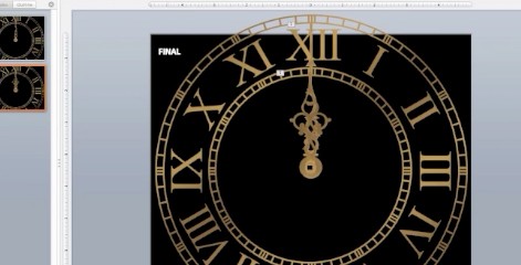
Download Link This podcast was quite the multimedia adventure.  I edited the clock face from a stock vector (Clock Vector by Fatalyze at deviantArt) in Photoshop, then live traced it in Illustrator.  I also created the clock hands in Illustrator.  I imported both into Microsoft Powerpoint, where I created the clockwork effect as described in this tutorial.  I used Quicktime to record the screen capture and my voice, then imported the video into iMovie, where I had to tweak the audio controls to bring out my voice.  Next, I created the music in GarageBand.  I used a lot of rubber-banding to control the volumes of the different lines of music. I made all of the static images in Photoshop.  I kept them simple because I wanted them to reflect the design of my website, which is quite minimalist.  I deliberately chose a sans serif font that would contrast with my busy logo. One objective of this assignment was to keep the podcast under 5mb, which limited the amount of video I could implement without really sacrificing quality.  It’s still too fuzzy for my tastes unless it’s kept to a minimal size, but its small file size allows for easy downloading or streaming, which is important for simple tutorial videos like these.  My target audience for this podcast is people like me, who enjoy trying new things and learning on their own, but don’t want to wait for a huge file to...

Read More

Handi-Snacks Product Redesign

Handi-Snacks Product Redesign

Posted by on Mar 7, 2013 in Graphics |

Handi-Snacks Product Redesign   For my Advanced Visual Media class, we were challenged to take an outdated or “ugly” package and redesign it.  While I don’t think the Handi-Snacks Breadsticks n’ Cheese Package is hideous, I was intrigued by the possibility of creating a cup-like package instead of the plastic cartridge.  I was inspired by Yan-Yan, a similar Japanese snack.  This project really challenged my knowledge of Illustrator and InDesign, but I’m glad to say that I learned and accomplished a lot.  I particularly learned a lot about working with vectors and shapes instead of using freehand drawing, which is my preferred design method. To create the package, I took apart a Yan-Yan package and scanned it into Illustrator so I could trace its rough shape.  Working with a tapered cylinder was the most difficult aspect of this project.  All of the graphics I created had to be tapered on the bottom to follow the shape of the package.  I used an online tool to generate the Nutritional Facts panel and WhattheFont.com to figure out which fonts to use.  I was able to download the Hand-Snacks logo from the internet, then live traced it in Illustrator to make a version I could edit.  I made the barcode simple by using a barcode font from dafont.com.  All of the other elements of the package I made using the shape tool and pen tool, including the mouse lid.  I printed the lid on 100lb glossy cardstock and the label on sticker paper, and I constructed the package using pieces from the dismantled Yan-Yan package and lots of glue. As part of the assignment, I also created a product design booklet to use in my “pitch” to Handi-Snacks.  I used InDesign for most of the layout and content.  A notable exceptions are the product packaging itself (made in illustrator, as mentioned above), the product photo (shot by me and edited in Camera Raw), and the print advertisement, which I created in Photoshop using a photo I took myself of my cousin and her son.  I used the quick selection tool to cut them out of the original photo and replaced the background with a a cartoon background vector (Kitchen Background by ~kellistrator at deviantArt.com; used with permission).  To add an extra touch of whimsy, I used the brush tool and doodled onto the...

Read More

Large Print

Posted by on Mar 2, 2013 in Blog, Photography |

This is yet another variation on my light painting.  This one will be printed at 20 x 30 and framed to hang in the Spori. My rommate Brit and I made this using a small pocket light. I first focused the camera with the lights on, then, still holding the focus, turned off the light and pushed all the way on the trigger to take the shot.  During the six minutes that my shutter remained open, Brit used the pocket light to briefly splash the mask, candy dish, lantern and the candle with light. Behind the lantern you can see a light trail left by the brief moment her light shined directly into the camera lens.  As you can tell from my earlier posts, I have several variations of this scene, because each time we shot the lighting and colors turned out very differently.  I ultimately decided to print this one because I think the focus in this image is better than that of the others, and I love the shade of purple on the candle in the back and hints of blue in the lantern. I used the lasso tool and content aware fill to remove a label from then lantern, boosted the vibrancy, and added a dark vignette in Camera Raw to soften the edges and keep the eye from wandering off the edge of the image. Original:...

Read More