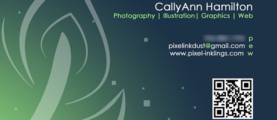
I designed this business card for myself before I really started delving into video, started using a new email address, and decided to make all of my branding match my site, so this design is a little out of date now, but I thought it was worth sharing. This design was made in Photoshop. The quill motif comes from another self-branding idea I was playing with for my online web handle: I wanted this one to reflect three ways I like to express myself; digitally (pixel), in print (ink) and in pencil (dust). Thus, the dot of the first i is square like a pixel, the dot of the second i looks like a splatter of ink, and the t was rendered to look like it was drawn roughly with a dry medium. I drew the quill in Illustrator. I thought about using this as a watermark/signature on all of the work I post online, but I haven’t committed to the idea...
Read MoreThink Ink Business Card
I designed this as the back of a potential business card. I created it in Photoshop...
Read MoreSpark Comics and Games Logo Designs
One of my first Illustrator projects called for designing three different logos for a fictional business. I decided to do logos for a comics and games hobby shop called “Spark.” For my three logos, I wanted to infuse three different “flavors” of comic style. The first represents the superhero comics of the 1930s and 1940s, with sharp angles, vivid colors, heavy dark outlines, and a burst bubble motif. The second represents the edgy ninja and samurai action-dramas of Japanese manga. The third represents the “Family Circus” syndicated Sunday funny pages look. All of the logos were made essentially the same way, using a combination of the Pen and Direct Select tools to create shapes (such as the bursts) and manipulate the text. For the first logo, I skewed and tilted each letter. To create the spiky effect of the second logo, I used the Direct Select tool so pinch off pieces of the text. The speech bubble shape in the third logo was made by merging an ellipse with a three-sided polygon using the pathfinder...
Read MoreMissions and Marriage Research Paper and Poster
Missionaries and Marriage Research Paper My group in my Communication Research Fundamentals class decided to do a focus group to study the effects of The Church of Jesus Christ of Latter-day Saints’ missionary minimum age change, announced in 2012. For my part, I wrote the focus group questions, the first finding, The first conclusion, organized the bibliography and the appendix, and I created the layout and compiled the entire research paper in InDesign. My inspiration for this layout was the Mormon.org website, with its bright and cheery colors and speech bubble motif, since this site and the topic of our research paper both correlate directly to the missionary culture of the Church of Jesus Christ of Latter-day Saints. After completing the research paper, I transposed the research paper and design into a poster for display at the Brigham Young University – Idaho Research and Creative Works...
Read MoreScarborough Fair Brochure
For this assignment I was tasked with designing a two-sided, folding brochure for an event or company. I decided to make a design for a fictional Renaissance Festival in Orlando. I wanted to create a visual pun based on the traditional ballad, “Scarborough Fair,” by placing images of parsley, sage, rosemary and thyme on the peeking panel. I echoed that design element by picking four shades of green from those images and repeating them in squares throughout the brochure. Most of the work for this project was completed in Adobe InDesign. I created the Celtic knot logo in Adobe Illustrator and I removed the background from the photo of the toasting couple in Photoshop. I collected the photos from the internet, as this is an educational-purposes...
Read MoreZions Bank Banner
I designed this logo for the team behind Quidlum.com as a pitch to Zions Bank. In creating this banner, I tried to replicate the style of the Zions Bank website. It was great practice for Illustrator’s pen...
Read MoreContent-Aware Responsive Web Banner Tutorial
Responsive Web Banner Tutorial I was asked to make a tutorial for a potential use for photography. Since I love code and I’d recently learned about responsive web design, I wanted to learn (and, ultimately, teach) how to make a web banner that can adapt to the screen resolution. Beyond simply scaling down, the “content” of this banner (the plant cutout) scales at a different rate from the background. It’s easier to understand if you see it in action. Try grabbing the edge of the browser window and dragging it in and out to see the banner change! I created the tutorial itself in InDesign. The sprout and the background are images of...
Read More“Inklings” Photobook Preview
...
Read More