


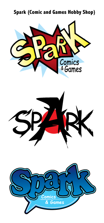
One of my first Illustrator projects called for designing three different logos for a fictional business. I decided to do logos for a comics and games hobby shop called “Spark.”
For my three logos, I wanted to infuse three different “flavors” of comic style. The first represents the superhero comics of the 1930s and 1940s, with sharp angles, vivid colors, heavy dark outlines, and a burst bubble motif. The second represents the edgy ninja and samurai action-dramas of Japanese manga. The third represents the “Family Circus” syndicated Sunday funny pages look.
All of the logos were made essentially the same way, using a combination of the Pen and Direct Select tools to create shapes (such as the bursts) and manipulate the text. For the first logo, I skewed and tilted each letter. To create the spiky effect of the second logo, I used the Direct Select tool so pinch off pieces of the text. The speech bubble shape in the third logo was made by merging an ellipse with a three-sided polygon using the pathfinder palette.